RUBY CUP | UK | rubycup.com
Designing the conscious menstrual health brand.
Ruby Cup set out to do more than sell a product — they exist to create positive, systemic change in the way menstruation is lived and understood. Their mission is bold: to provide sustainable menstrual health solutions to all people, regardless of income, while dismantling taboos and delivering education rooted in care and scientific evidence.
The challenge
By 2017, the company had grown into a powerful voice in the global menstrual health space. But their brand no longer reflected their strength or values. Visually, they felt outdated, fragmented and emotionally disconnected. In an emerging landscape filled with femtech startups and purpose-driven brands, Ruby Cup needed a clear, confident identity to match their depth and ambition.
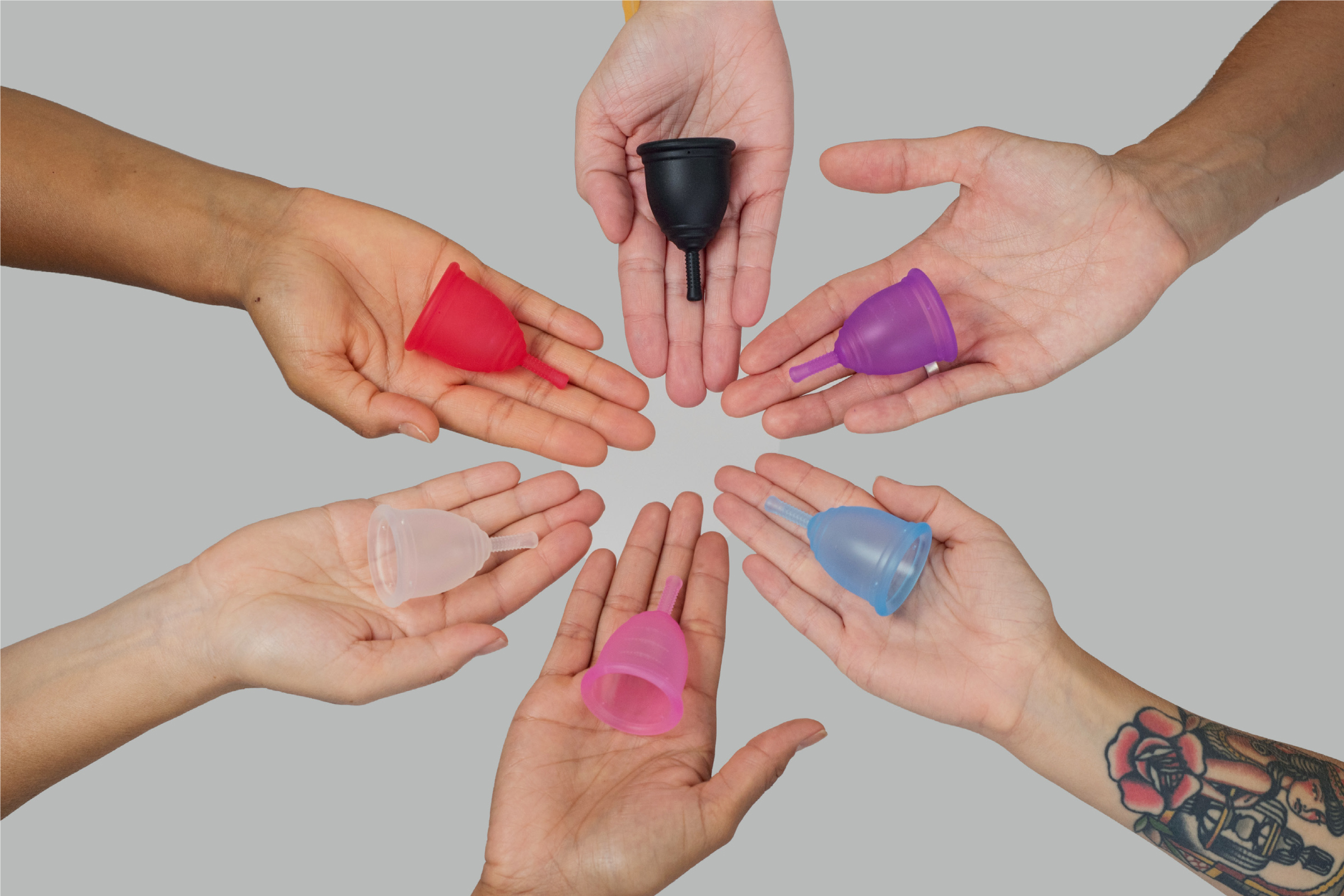
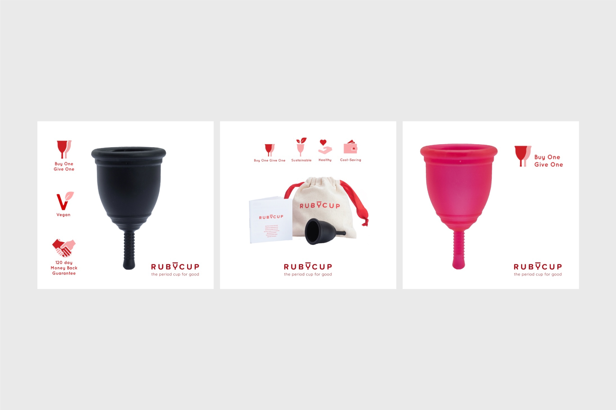
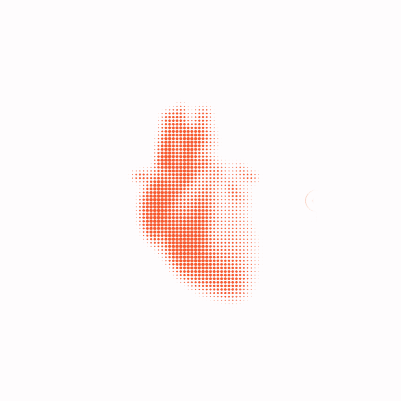
The iconic shape of the menstrual cup became the foundation of the new logo — simple, memorable, and proudly visible.
The solution
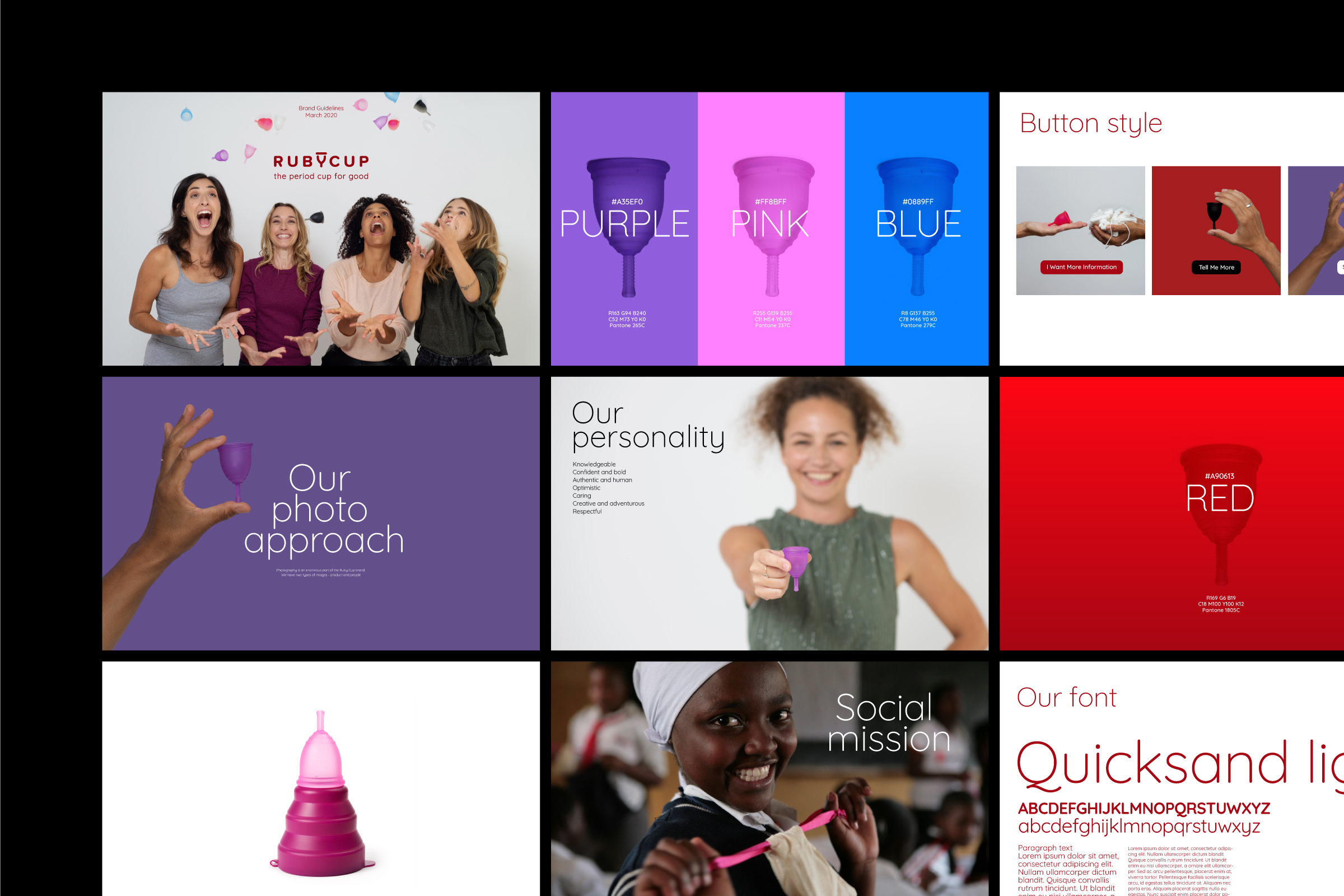
We began by embracing what many brands avoid: the product itself. The iconic shape of the menstrual cup became the foundation of the new logo — simple, memorable, and proudly visible.
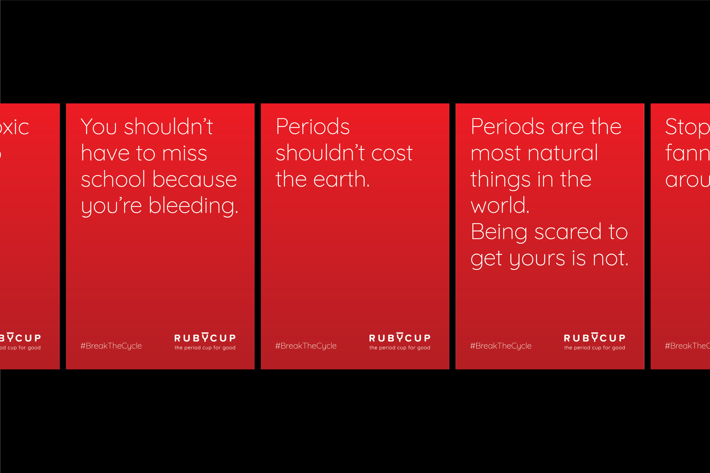
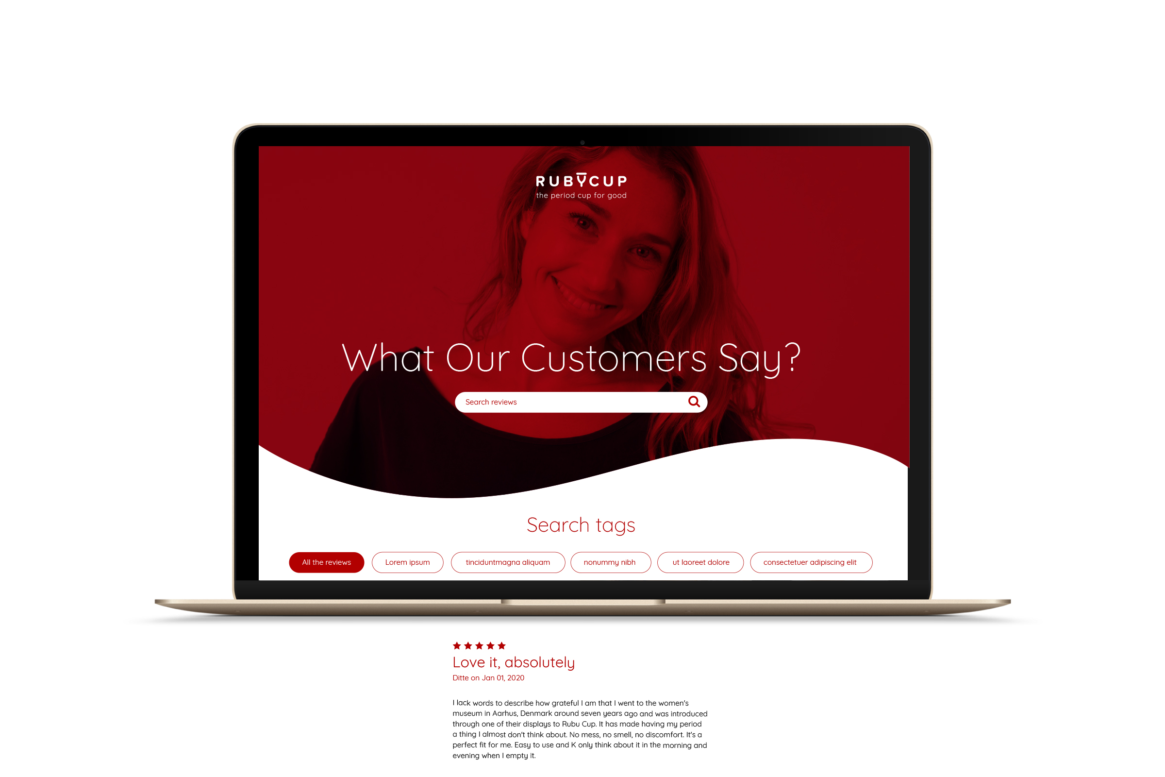
Around it, we developed a complete visual identity that captured Ruby Cup’s brave, honest and human attitude. We chose a warm, inclusive color palette far from stereotypical femininity. Photography focused on real people, with no filters or forced idealism. The typography was clean but full of character, and a custom illustration style made educational content accessible across cultures and contexts.
The result was a system that could hold both the emotional and the functional — activism and education, community and clarity — all under one unified voice.
The impact
The rebrand helped Ruby Cup step into a new phase of growth. It gave their community something to connect with and stand behind — not just a look, but a feeling.
Since the launch, the brand has remained strong, recognisable, and emotionally relevant. The visual identity continues to support a global mission and a loyal, engaged audience that sees Ruby Cup not just as a product, but as a force for dignity and change.
"Saul completely reimagined our brand to ensure our visuals conveyed our personality and values. He asked all the right questions and helped us put into words and images what Ruby Cup meant to us. With that information, we created a new Ruby Cup visual universe where our visuals reflected what we are *really* about. Saul was very thorough and considerate, a great listener... and really fun to work with! He listens but he is also proactive on his opinions and recommendations. I would not hesitate to recommend Saul to anyone on the path to creating a brand with purpose."
Amaia Arranz – CEO at Ruby Cup.
Related Projects

RubycupDesigning the conscious menstrual health brand.

Alfred&FriendsProperty management with a friendly approach.

CaarmenCreating a tech brand with a human heart.
SpecialsBuilding a whole new spices brand that breaks the rules.

TwoTimesEvents like never before, rebranded.

AirocCreating a tech brand with a human heart.
NIVDDecoding the invisible.

Vimerson HealthRedefining wellness through balance

MegaGenEstablishing a global brand in a local market
© The Branding Studio 2025 | Privacy Policy | Cookies Policy | Legal Notice