Vimerson Health | USA | vimerson.com
Vimerson Health—Redefining wellness through balance.
Vimerson Health, a North American wellness company, approached us with the need to explore a potential evolution of their brand identity. With a solid foundation and a loyal customer base, they were looking to assess how their visual system could better reflect their values and ambitions moving forward.
Our work focused on identifying opportunities for growth within the existing brand—uncovering the untapped potential to enhance clarity, emotional connection, and strategic coherence across all brand expressions.
From this strategic narrative, we built a visual system rooted in the concept of balance.
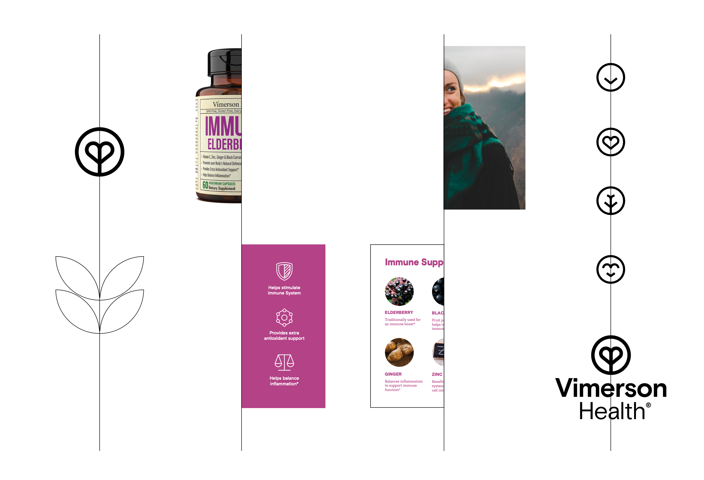
The solution
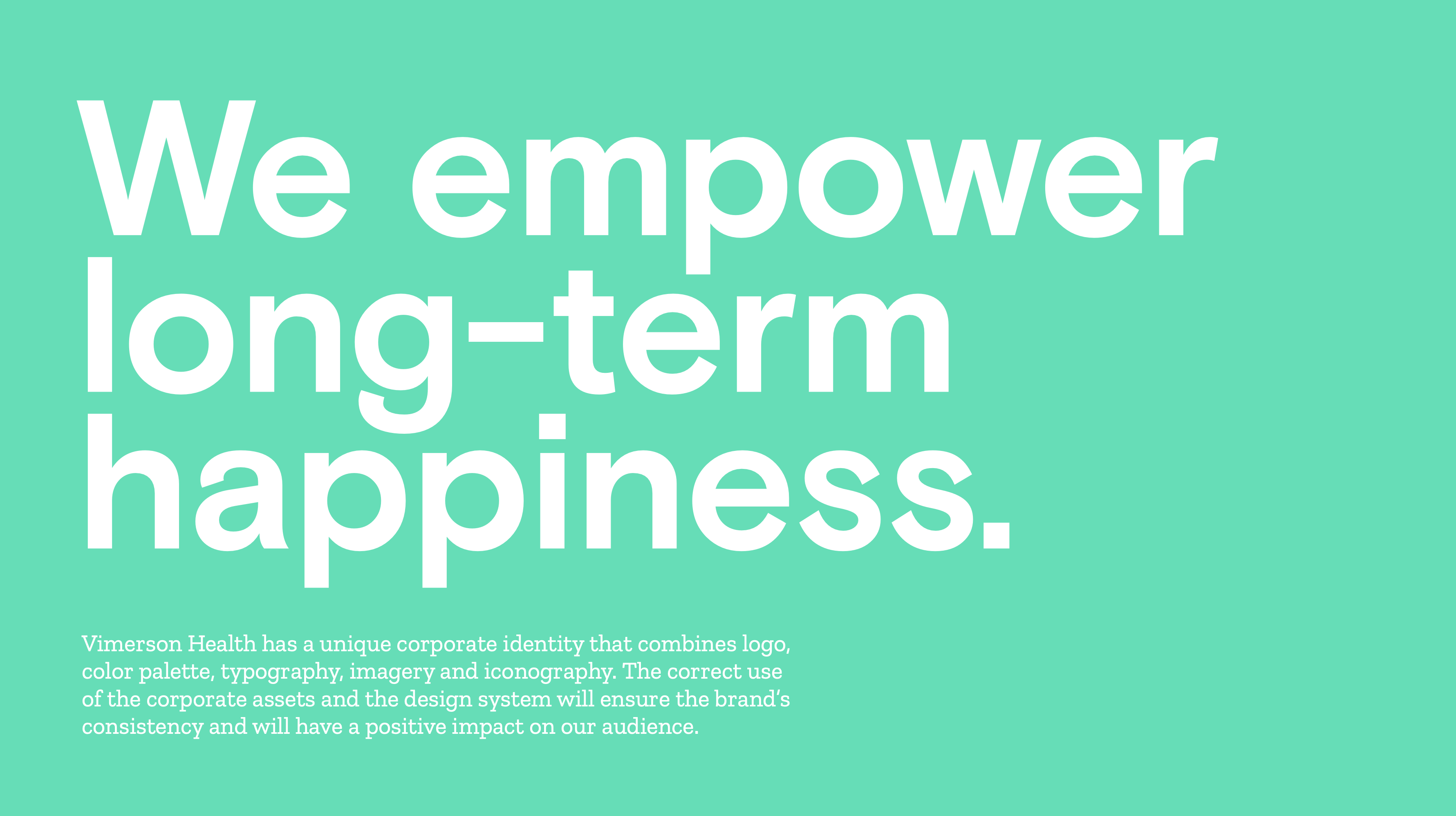
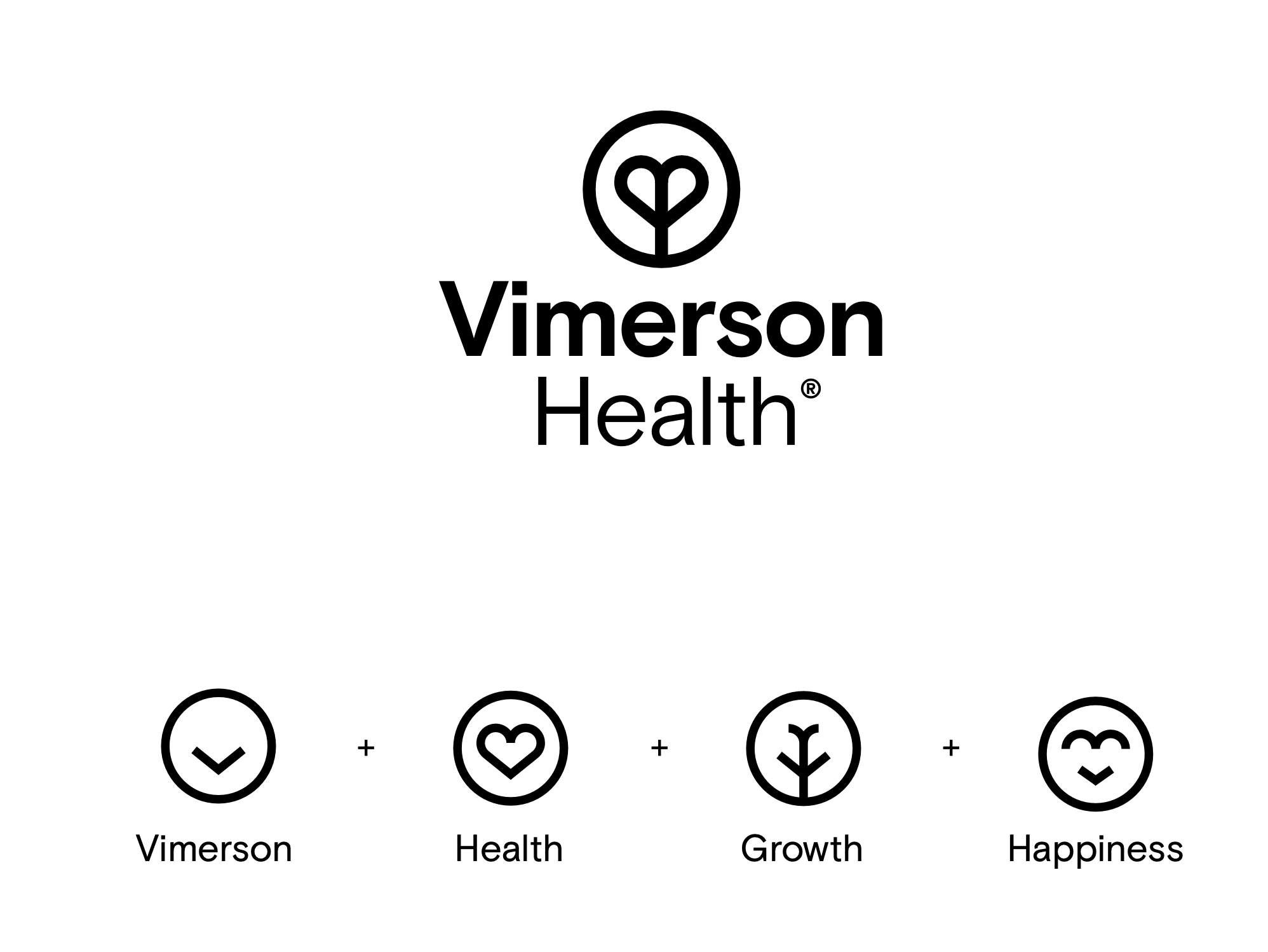
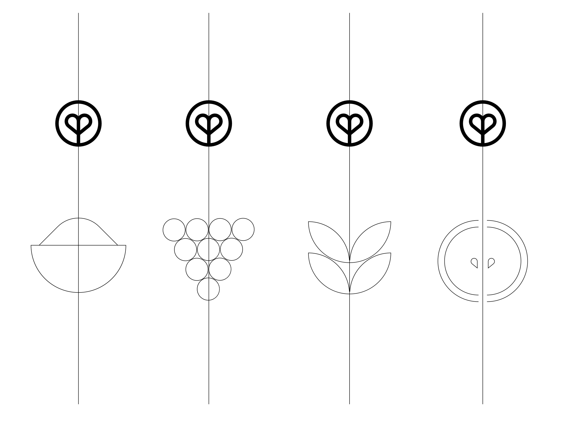
We began by distilling and aligning Vimerson’s core values: health, growth, and happiness. These pillars became the foundation for a refreshed brand narrative, captured under the unifying concept: “We empower long-term happiness.” This idea reframed wellness as a sustainable, long-term journey—moving beyond quick fixes toward balance and intentional living.
From this strategic narrative, we built a visual system rooted in the concept of balance. Drawing on principles of geometric symmetry and visual harmony, we created a design language that conveyed clarity, calm, and strength. This wasn’t just an aesthetic decision—it was a structural one. The logotype itself embodies the three core values through a composition based on mirrored balance.
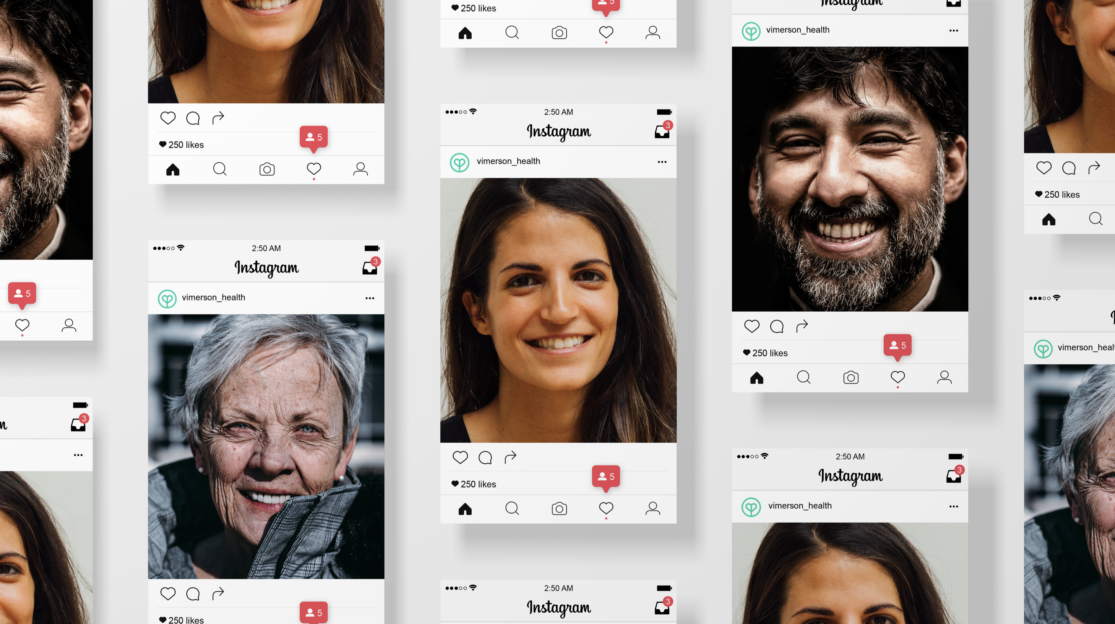
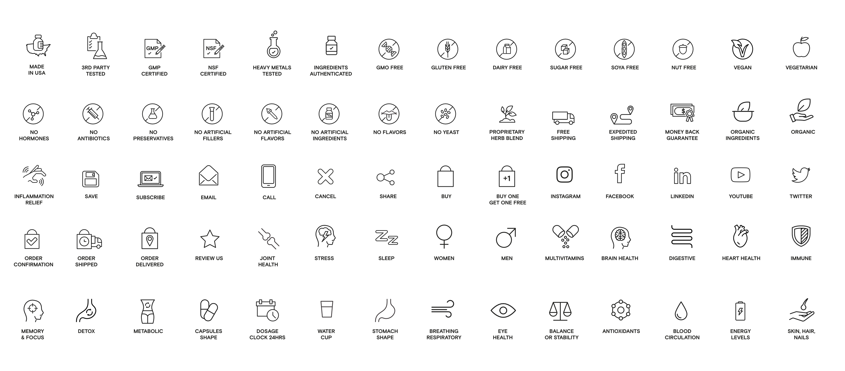
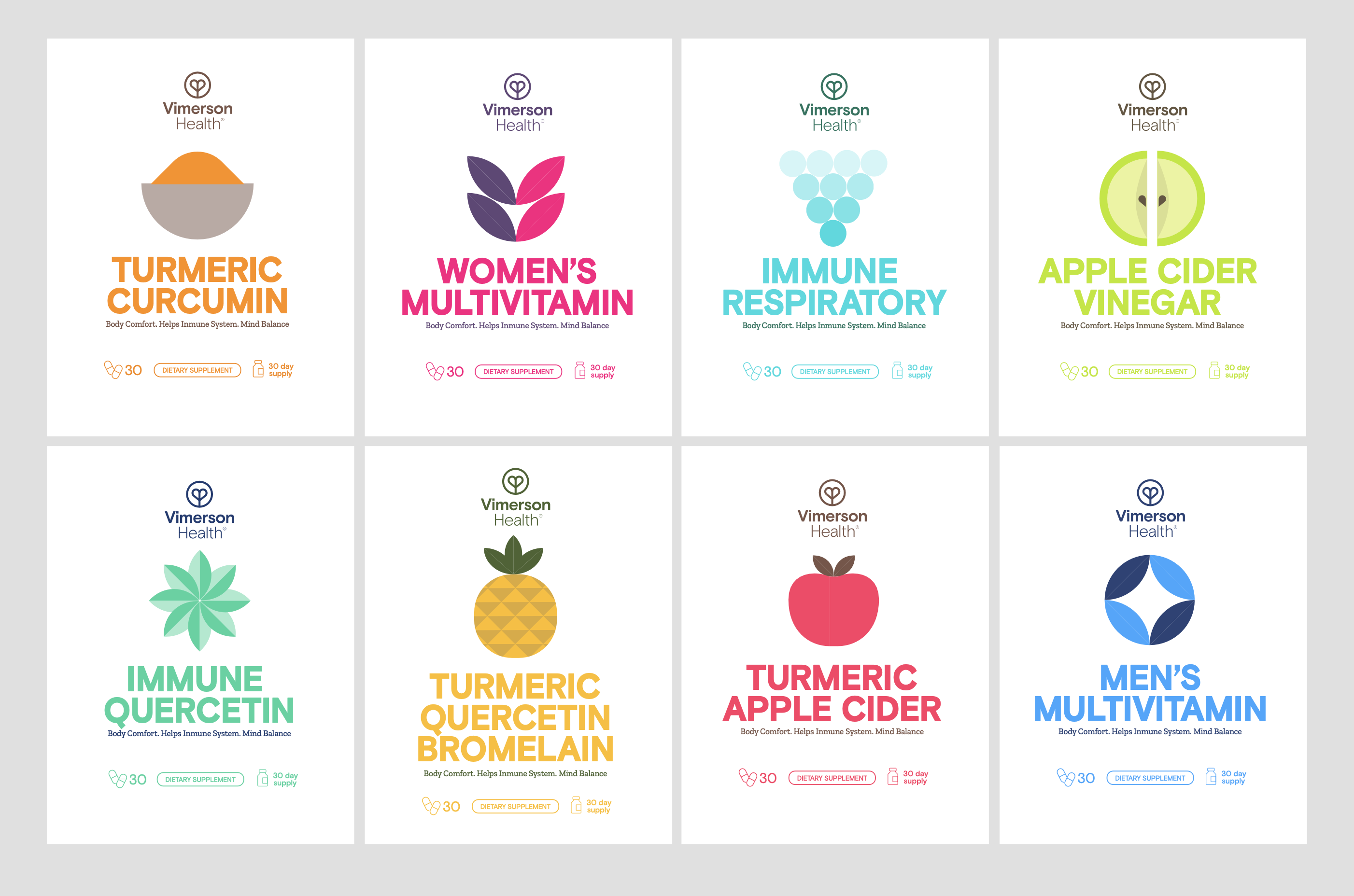
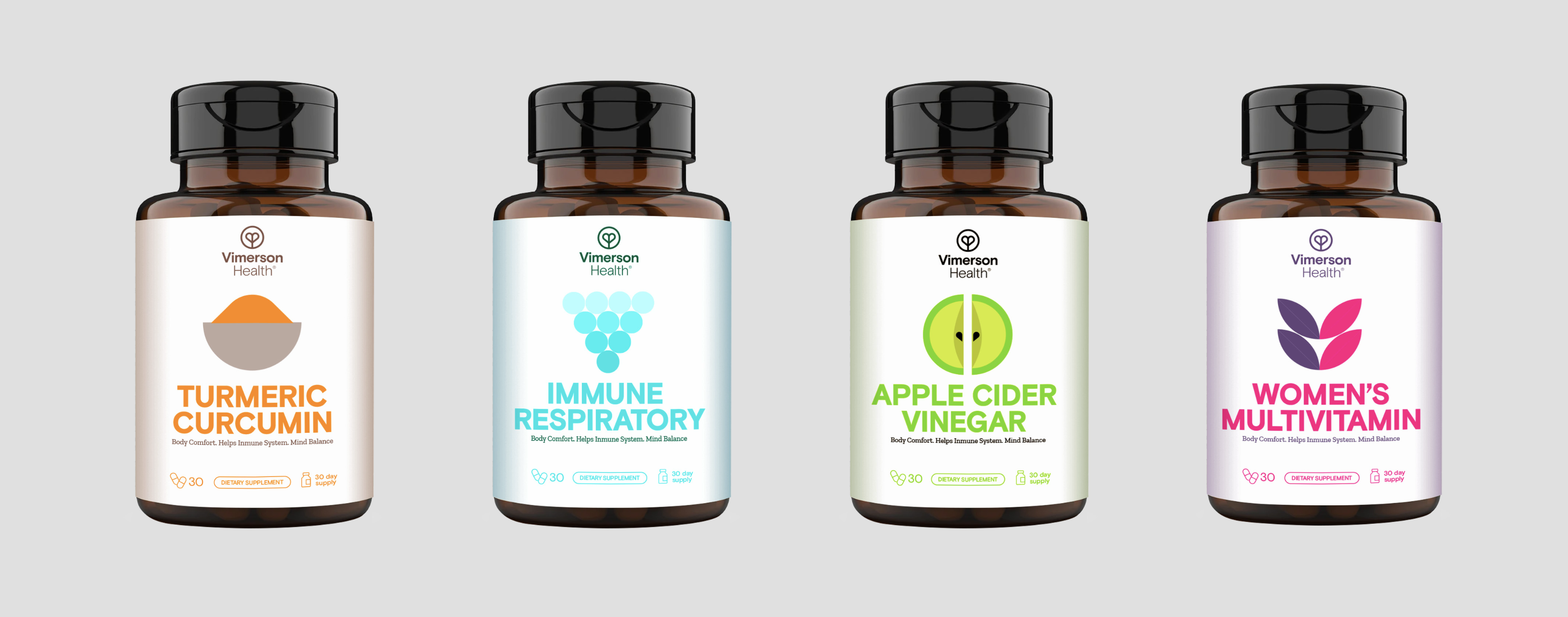
This symmetrical principle extended throughout the brand’s visual system—defining layout grids, icon styles, motion behavior, and packaging structures. The result was a coherent and emotionally resonant identity system designed to support long-term brand storytelling.
We developed a complete rebranding proposal ready for implementation, aligned with Vimerson’s strategic goals. The result was a brand that not only looked more contemporary, but felt more aligned with its mission: empowering individuals to cultivate lasting wellbeing through inner balance and mindful growth.
The impact
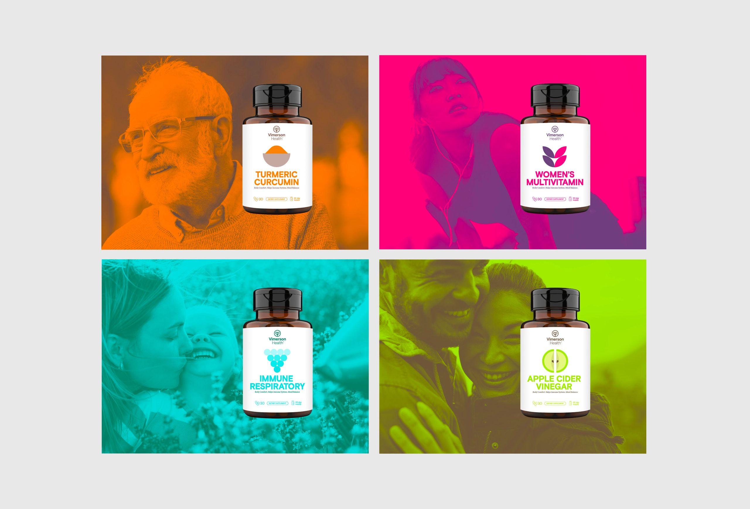
The new identity redefined Vimerson Health’s potential within the competitive wellness space. With a system built on balance and clarity, the brand now communicates with greater emotional resonance and strategic coherence. The design is both consistent and flexible, empowering the team to express a modern, aspirational lifestyle that stays true to its North American roots while speaking to a global audience.
"Saul is a true design god. The team made us feel like friends from day one. This makes the collaboration very easy and enjoyable. It was amazing to see how they transformed our feelings and desires into a next level brand. Well done. We can't wait to grow as partners and friends!"
Elise Spaan – Managing Director at Airoc.
Related Projects

RubycupDesigning the conscious menstrual health brand.

Alfred&FriendsProperty management with a friendly approach.

CaarmenCreating a tech brand with a human heart.

SpecialsBuilding a whole new spices brand that breaks the rules.

TwoTimesEvents like never before, rebranded.

AirocCreating a tech brand with a human heart.

NIVDDecoding the invisible.

Vimerson HealthRedefining wellness through balance

MegaGenEstablishing a global brand in a local market
© The Branding Studio 2025 | Privacy Policy | Cookies Policy | Legal Notice