AIROC | Netherlands | airoc.nl
Creating a tech brand with a human heart.
Airoc was born with a clear ambition: to challenge the status quo of workplace learning. In a world facing labor shortages and rising unemployment, Airoc addresses a critical gap — helping entry-level employees become productive, faster.
The challenge
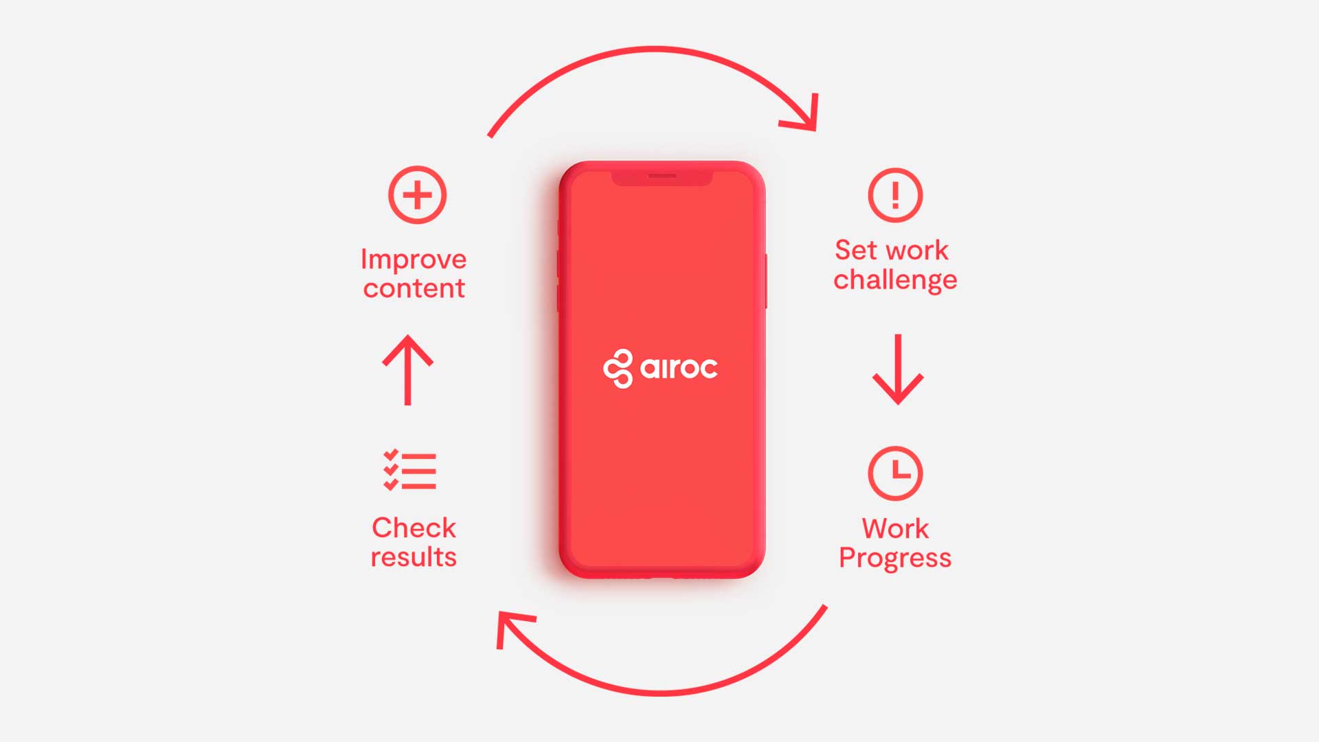
Their approach goes beyond e-learning. They integrate onboarding, coaching and real-time job training into one efficient, elegant system. Airoc's mission is both societal and strategic: to support businesses of all sizes while empowering individuals through practical, accessible learning.
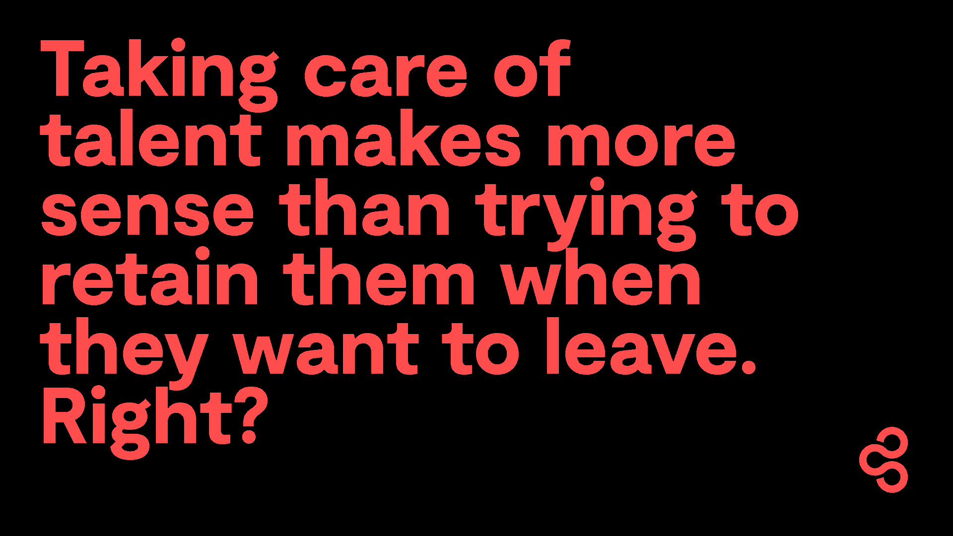
To bring this to life, Airoc needed a brand that could express both innovation and humanity — a voice that could resonate in the Dutch market, but also scale globally. The challenge was to create a bold identity that positioned Airoc as a trustworthy disruptor in a space full of noise, buzzwords and generic tech branding.
The solution
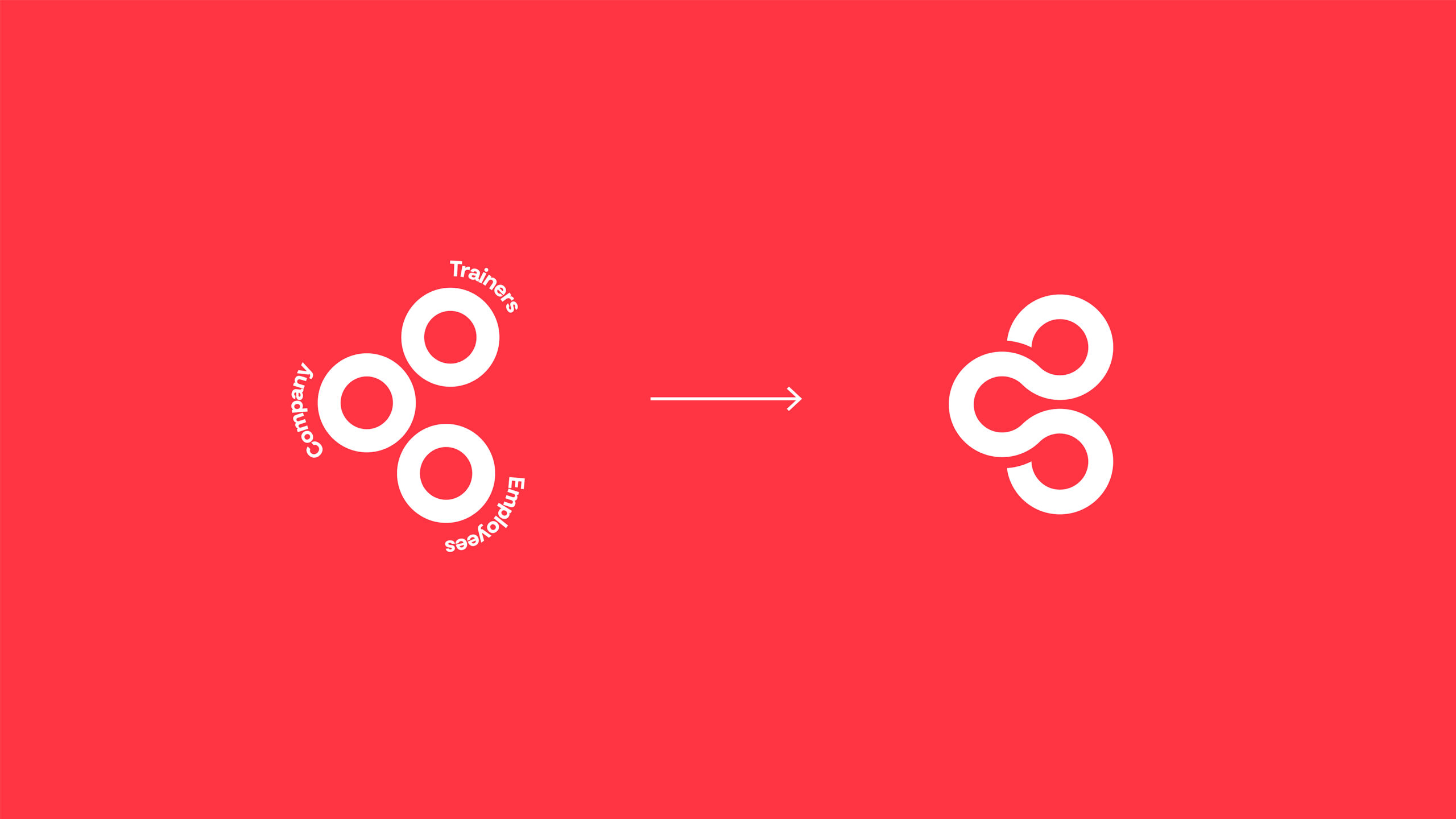
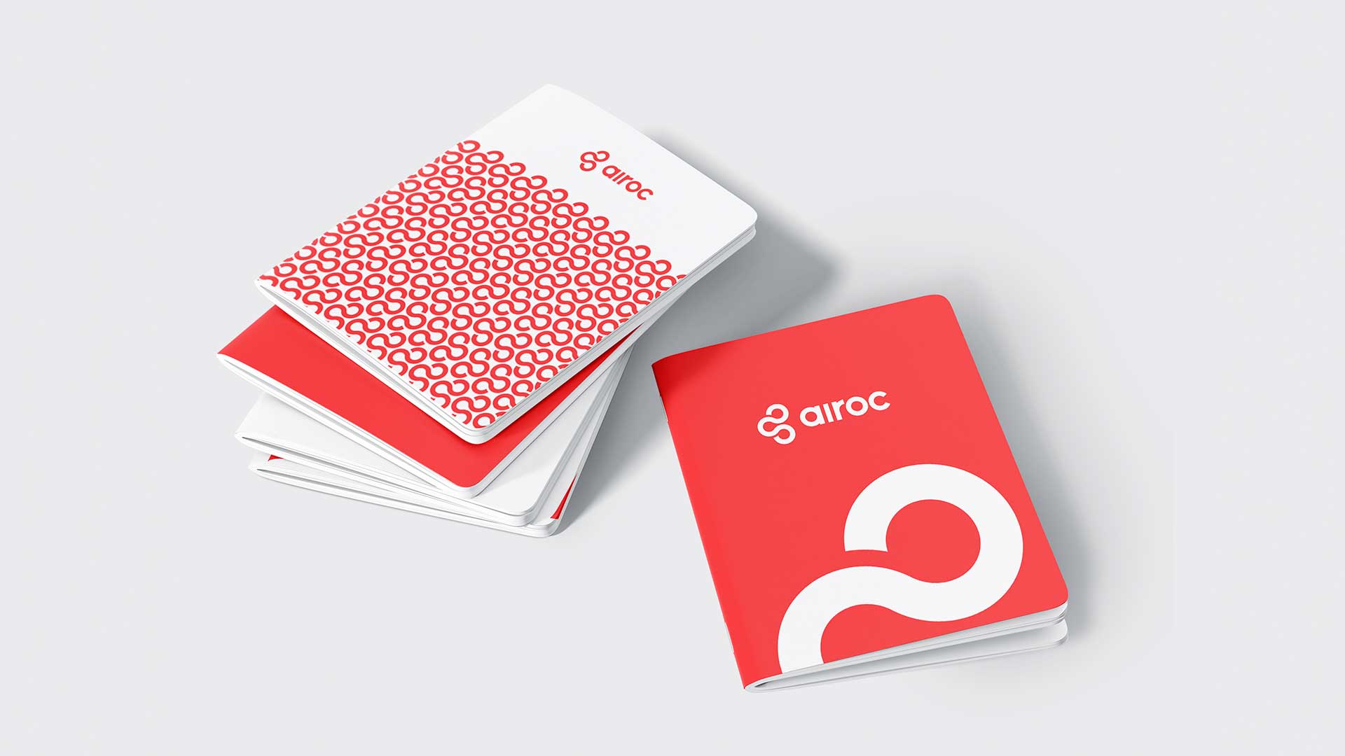
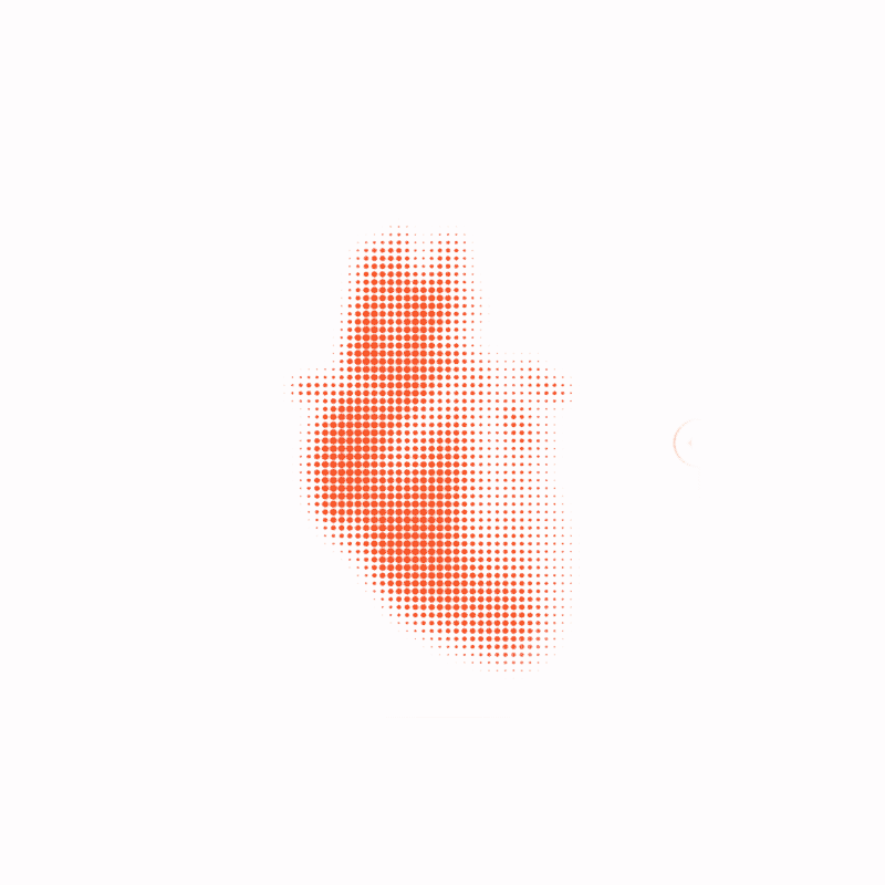
We started by distilling the essence of their mission: connection. Airoc's model is built around three core players — employees, coaches and students — and we turned that into a visual concept.
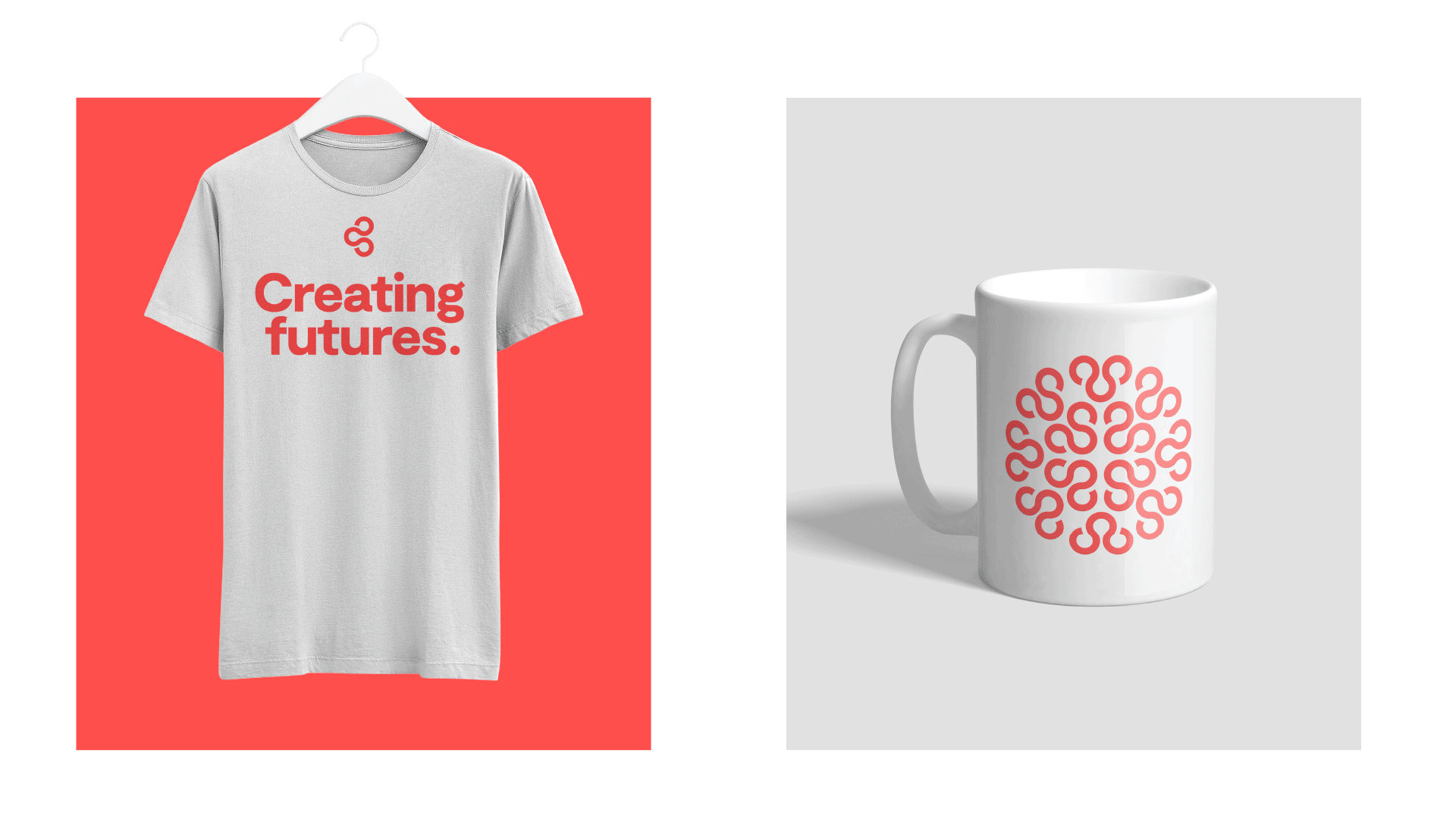
The symbol we created brought these three pillars together into a unified, dynamic mark: a visual anchor that expresses clarity, purpose and forward motion.
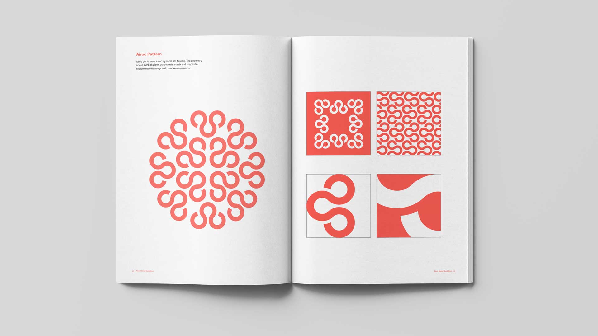
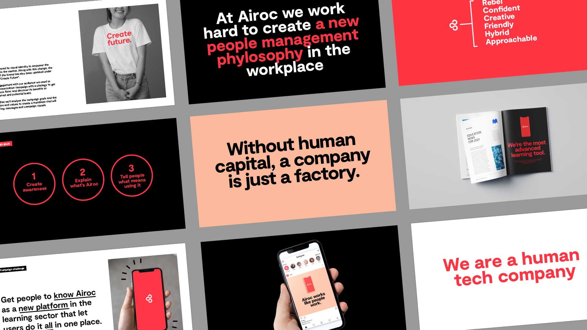
From there, we built a design system that balanced the digital and the human. The visual language is clean but rich in emotion: bright but grounded, confident but approachable. We combined structured layouts with curved forms, accessible typography with bold messaging, and a color palette that speaks to both enterprise clients and end users.
The result is a brand that feels contemporary, trustworthy and genuinely useful — a system ready to scale in multiple markets without losing its sense of purpose or personality.
The symbol we created brought these three pillars together into a unified, dynamic mark: a visual anchor that expresses clarity, purpose and forward motion.
The impact
The new Airoc identity gave the company the visual power to match their ambition. Internally, it aligned teams around a clear and compelling story. Externally, it positioned them as a serious contender in a market full of empty promises and aesthetic sameness.
Airoc now enters conversations with a brand that feels strong, meaningful and distinctive. A brand built not just for tech, but for people — and for the future of learning.
.
"Saul is a true design god. The team made us feel like friends from day one. This makes the collaboration very easy and enjoyable. It was amazing to see how they transformed our feelings and desires into a next level brand. Well done. We can't wait to grow as partners and friends!"
Elise Spaan – Managing Director at Airoc.
Related Projects

RubycupDesigning the conscious menstrual health brand.

Alfred&FriendsProperty management with a friendly approach.
CaarmenCreating a tech brand with a human heart.
SpecialsBuilding a whole new spices brand that breaks the rules.
TwoTimesEvents like never before, rebranded.

AirocCreating a tech brand with a human heart.
NIVDDecoding the invisible.

Vimerson HealthRedefining wellness through balance

MegaGenEstablishing a global brand in a local market
© The Branding Studio 2025 | Privacy Policy | Cookies Policy | Legal Notice